
Tech the halls with Logitech holiday
The holiday season remains as high revenue opportunities for our brands. The annual gift guide was launched to engage marketing channels for Logitech, Logitech G with a primary goal to get customers to purchase new or upgraded products.

The Background
With the outbreak of COVID-19 that forced all of us to stay inside, many outfitted their home offices, doctors adopting telemedicine and teachers using video calls for distance learning. Because of this, Logitech saw a dramatic increase in revenue during the beginning stages of the pandemic.
Sales of video collaboration products, which includes cameras, microphones, and software that allows for online meetings, increased by 60 percent compared to the same period last year, while keyboards, PC webcams, tablets, and accessories all saw double digit growth. This leverage was used to put more emphasis on their holiday campaign.
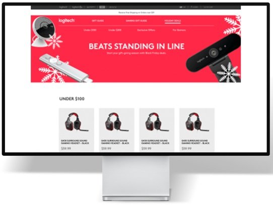
Previous UI & assets
The Objective
The primary aim of this project was to inaugurate the annual gift guide for both Logitech and Logitech G, with the overarching objective of stimulating customer product purchases.
Additionally, stakeholders sought to enhance the search experience within the product collections and align the design with Logitech's newly adopted branding aesthetics, a finding from previous research.

As the sole UX Designer, I managed user experience and web design from the initiation phase to the product launch. This involved organizing the content and visuals to ensure optimal mobile and desktop user experience, presenting drafts to stakeholders, and directing quality assurance and debugging efforts during pre-launch updates.
Team
One UX Designer
One Project Manager
One Developer
One UX Copywriter
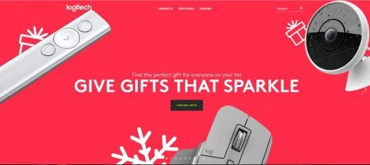
Design Direction
Logitech Design Guide
My Role
UX & Visual Designer
Tools
Figma
Adobe Creative Suite
Adobe Experience Manager
Invision
Constraints and pain points
At the time, the website's functionalities were constrained, and Logitech lacked a comprehensive component for tab navigation and anchor links. I addressed this by developing a tab component in Figma, equipped with the capability to dynamically include or exclude icons. This enhancement facilitated seamless user navigation across the three distinct product collections. It's worth noting that the involvement of a geographically dispersed development team extended the project timeline by an additional week.

The Solution
To transform the user experience into a holiday joyride, we didn't just build a product landing page; we created a festive gateway. Instead of the standard long-scrolling landing page, we introduced user-friendly tabs that let our visitors easily explore three distinct product categories.
In our quest to make the holidays even merrier, we teamed up with an external agency to conjure up the core visuals and assets for our enchanting campaign. As the resident UX sorcerer, I masterminded the entire single-page design, from the first flicker of an idea to the dazzling finish. This journey involved crafting content and visuals that worked seamlessly on both mobile and desktop screens, showcasing enchanting prototypes to our decision-makers, and guiding the quality assurance team to chase away any pesky bugs in our magical pre-launch updates.
Next Steps & Recommendations:
Conduct user research to get user feedback on the effectiveness of the website and make updates based on findings.